From my primary research I had found that posters promoting new horror films had the codes and conventions of:
- The image is of a main character, weapon or location from the film
- The text is in bold font, black on white background or white onto a black background
- The lighting is dark, similar to the lighting through the feature film which is usually dark
In my making of my poster for my film I adopted many of these codes and conventions, therefore making it recognisable to the audience as a poster for a film in the genre of horror.
To make my poster I used the software of Photoshop, and into this imported pictures I had taken on my digital camera so that I was able to use original images and those relevant to the film.
It took me a couple of tries to make the poster right, and before I made the one I am going to use I made this one:


I decided not to use this poster as my final piece because I do not think it is eye catching enough, nor has it enough detail on it, such as credits. I also did not want to use this poster as my final piece because I do not think it is exciting enough to be a poster to appeal to an audience.
On my final piece (below), I added more credits, the director and actors, as well as more eye catching fonts and images which are clear to see across the image or clown and the house (location of the film).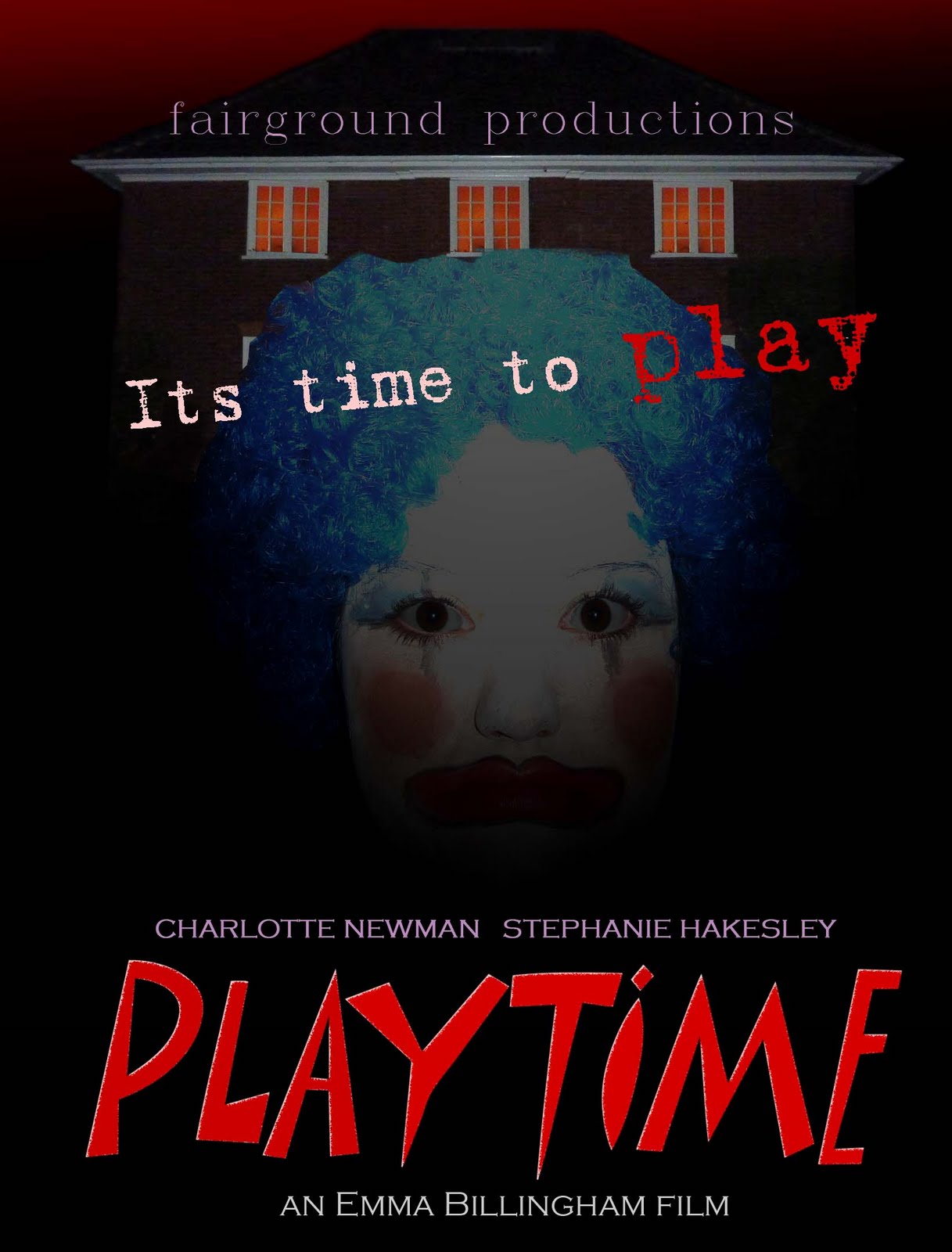
From my primary research I had found that magazine covers promoting new horror films had the codes and conventions of:
- Main character(s) from an anticipated film as main image
- Simple background colour or image, so as not to detract attention from the image
- Text about the film is larger than other text about magazine contents
- Title of the magazine is at the top of the page
In the making of my magazine cover I adopted many of these codes and conventions, therefore staying in keeping with what is expected from the buyers of film magazines and also producers of film magazines.
To make the magazine cover I used the software of Photoshop, and into this imported pictures I had taken on my digital camera so that I was able to use original images and those relevant to the film.
To make the magazine cover I used the software of Photoshop, and into this imported pictures I had taken on my digital camera so that I was able to use original images and those relevant to the film.
As with my poster I didn't get what I wanted first time, before my final piece I made this magazine cover:

This is my final magazine cover:
This cover is attractive to buyers and has more promotional text, of other films as well as about my film. Also, the font used about the film directly is more suitable for a horror genre, therefore making it more recognisable to the buyer of what is being promoted.
